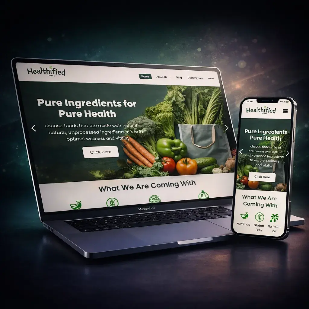
Healthified Zone: Redefining Digital Wellness through High-End UX Design
A magazine-style digital wellness platform built with typography-led design principles. Transformed a standard blog into a premium digital publication with focus on readability and brand authority.
Client
Healthified Zone (Wellness Publisher)
Role
WordPress Development & UI/UX Design Specialist
Powered By
Website
Visit Live"B29 Technology has an eye for detail that is rare. They didn't just build a website; they created a reading experience. Our audience loves the professional, clean, and engaging look."
The Challenge
The health and wellness sector is saturated with generic blogs. Healthified Zone faced a critical challenge: Differentiation. They needed a platform that didn't just display articles but commanded authority. The goal was to move away from the 'standard template' look and create a visually stunning, trust-building environment where readers would stay longer and engage deeper. The design challenge: How do you make complex health topics feel approachable while maintaining premium aesthetics?
The Solution
We approached this project as Digital Publishing Architects, not just developers. Typography-Led Design: We implemented a sophisticated 'Custom Design System' focused on font pairing and whitespace. This ensures that long-form medical content is easy to digest, reducing eye strain and bounce rates. Content Discovery Engine: Built advanced 'Featured Sections' and dynamic category grids using Elementor Pro, guiding users naturally from one article to the next. Mobile-First Reading Experience: Optimized the layout specifically for mobile readers (where 80% of traffic comes from), ensuring buttons are thumb-friendly and text scales perfectly. Cognitive Load Reduction: Used strategic whitespace to make complex health topics feel approachable.
Our Process
Visual Identity
Established a premium color palette and layout strategy that whispers 'Quality.'
Cognitive Load Reduction
Used strategic whitespace to make complex health topics feel approachable.
Typography-Led Design
Implemented sophisticated font pairing to ensure long-form content is easy to digest.
Speed Optimization
Balanced high-quality imagery with aggressive compression for instant loading.
Cross-Device Fluidity
Tested rigorously on 15+ screen sizes to guarantee pixel-perfect experience.